YouTube Symbols
Design:
Aaron La Lau, Marshall Bock
Design Leadership:
Tom Moran, Nate Koechley, Daniel Walsh, Jonathan Terleski
Having spent nearly a decade at YouTube, I’ve had the privilege of touching almost every corner of the product. Over the years, I’ve contributed to several chapters of the YouTube design system, but few projects felt as expansive as the 2025 icon redesign. Because iconography is such a foundational element of the system, this project touched every single surface of YouTube. As a lead designer on this initiative, my goal was to introduce a design language that brought greater clarity, consistency, and a distinct sense of YouTube’s personality to every screen. This redesign was about more than just aesthetics; it was about anchoring the platform's visual language for its next chapter.
A bold new look
When we kicked off this project, YouTube was approaching its 20th birthday. That’s two decades of
incredible creativity from the YouTube community, and a fair bit of design history too. Over
time, our icons
picked up a few different styles — like souvenirs from each era. This update gave us a chance to
tidy things
up and create a single, cohesive look that feels right for the next era of YouTube.
The previous full icon refresh was in 2019, and while those designs have served us well, the
platform has
changed significantly since then. For example, YouTube Shorts didn’t even exist at the time, and
has since
become
one of YouTube's most-used products. The TV has become YouTube's fastest-growing surface, with
people
watching
more than
a billion hours every day from their living rooms.
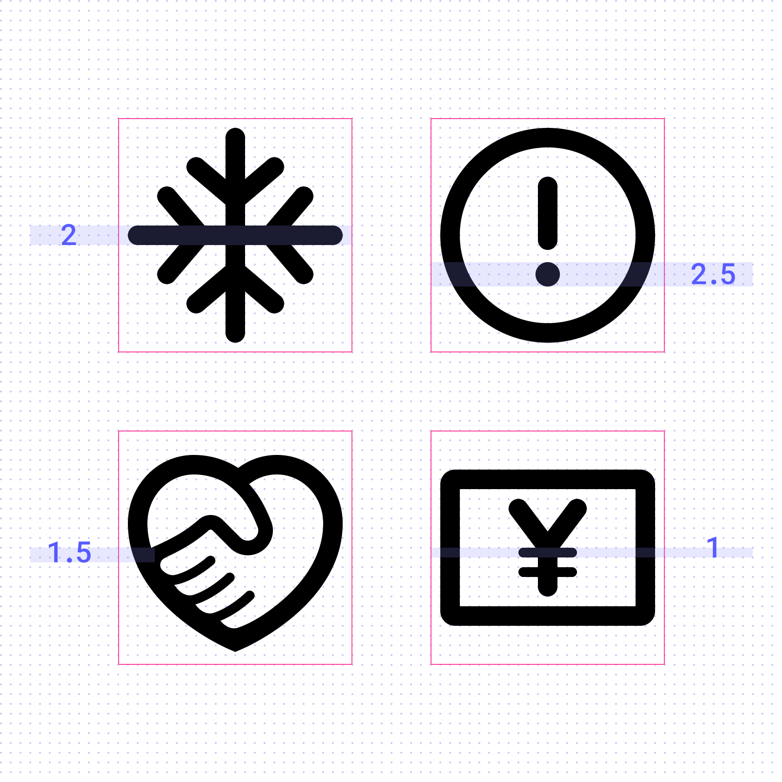
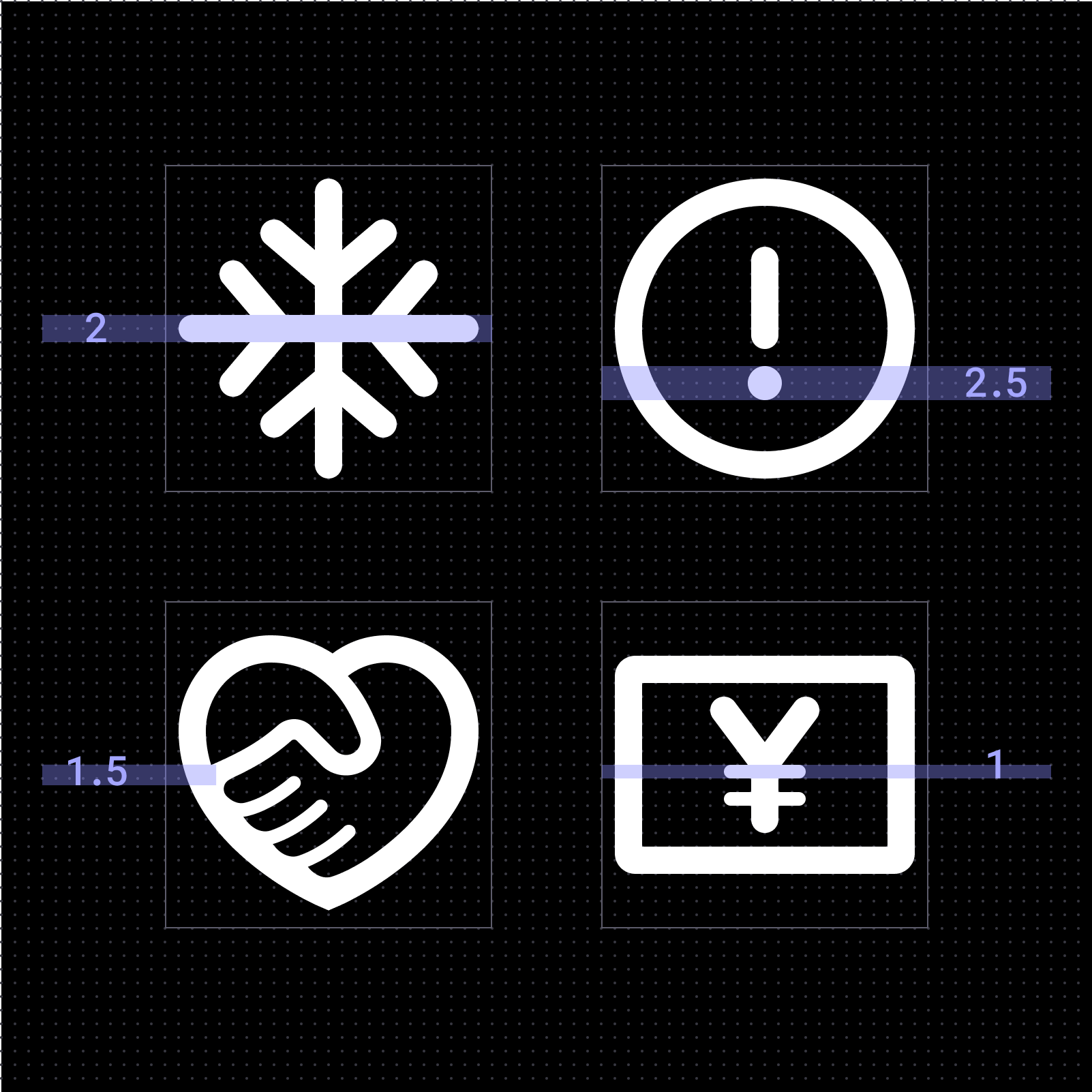
With this shift toward larger screens and richer visuals, clarity became our focus. We increased
the stroke
weight of every icon to improve readability in motion-heavy and immersive environments. On TV,
where icons
are viewed from a distance, the thicker lines and simplified forms improve legibility. The
updated weight
also aligns more cohesively with our bolder typography, creating a balanced and unified
interface across
contexts.
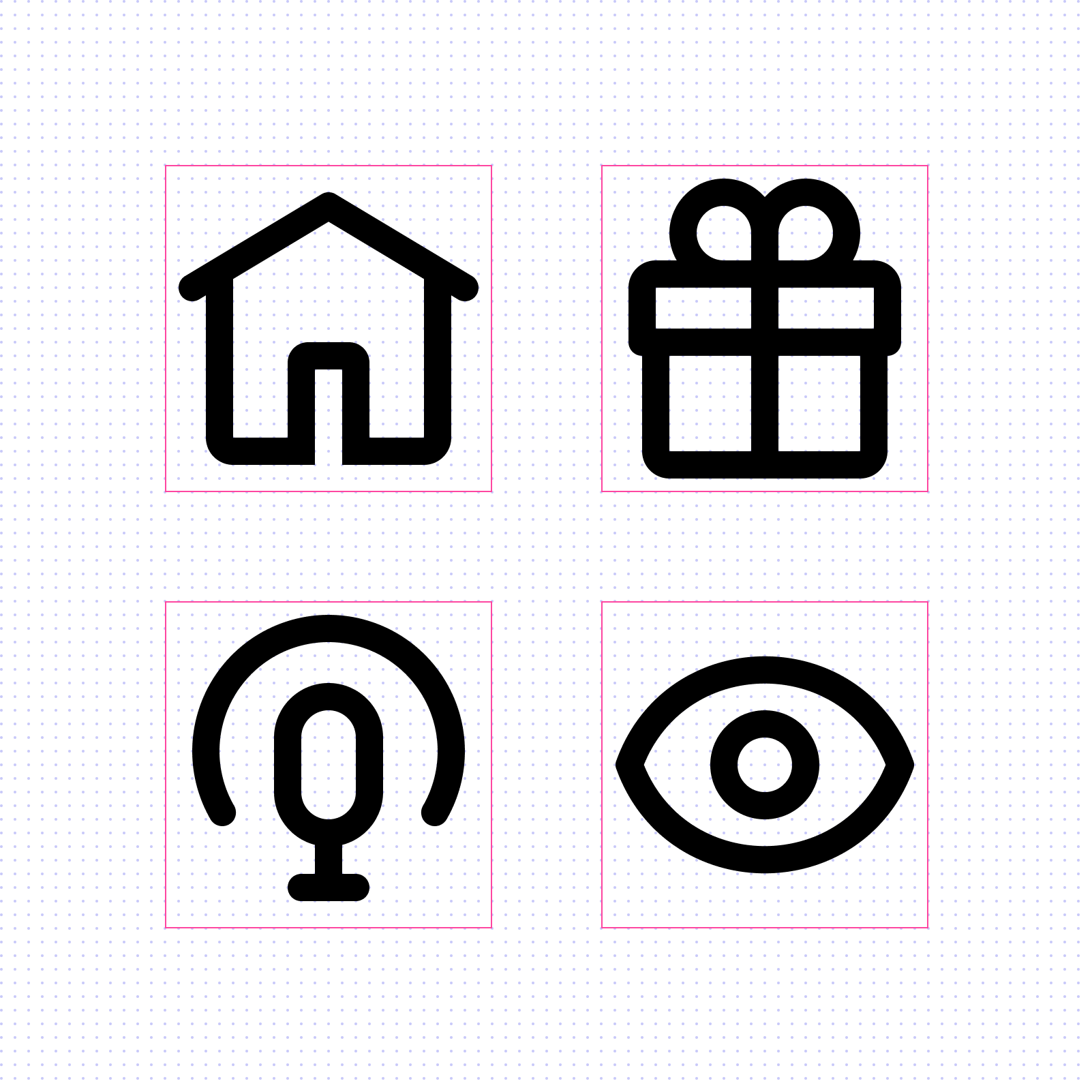
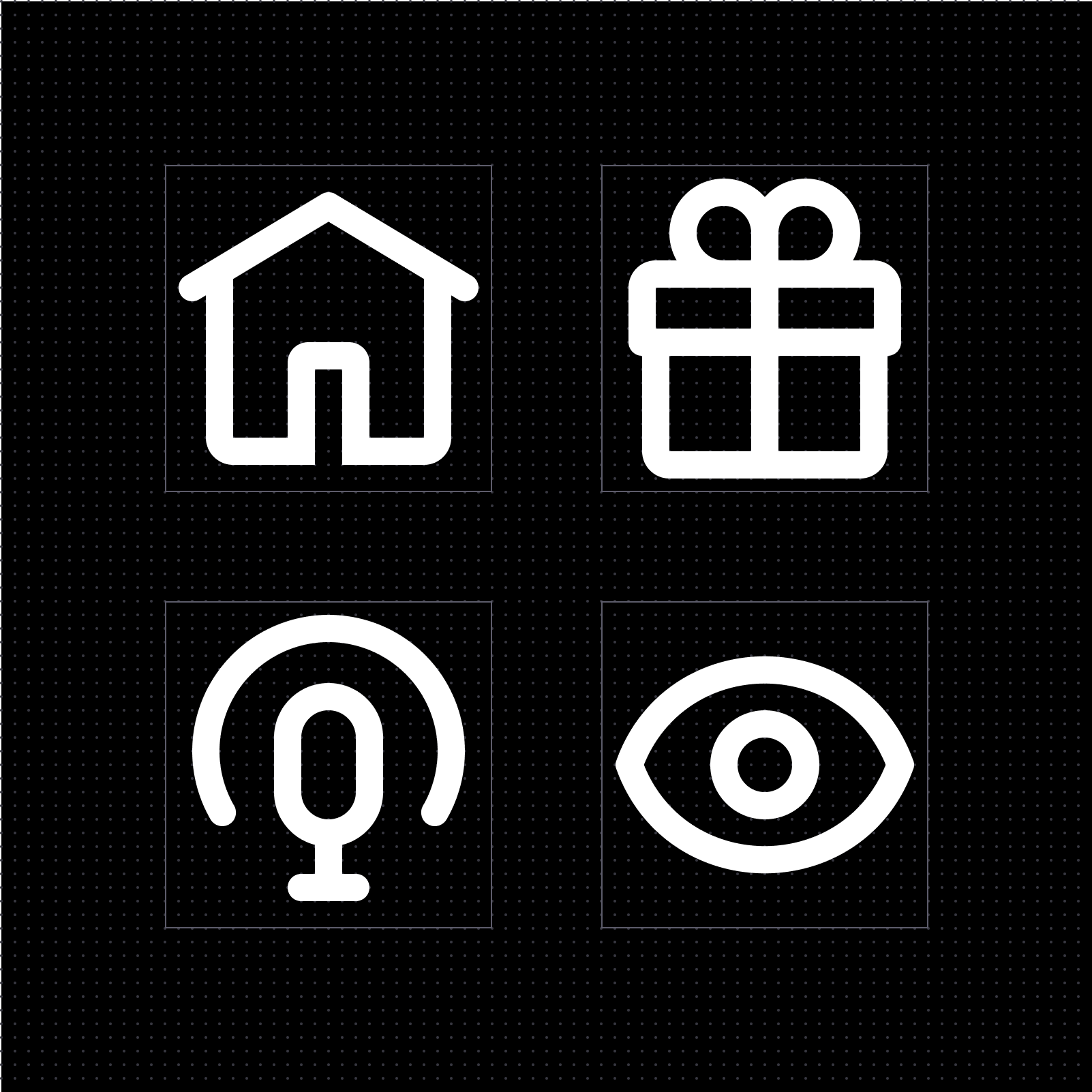
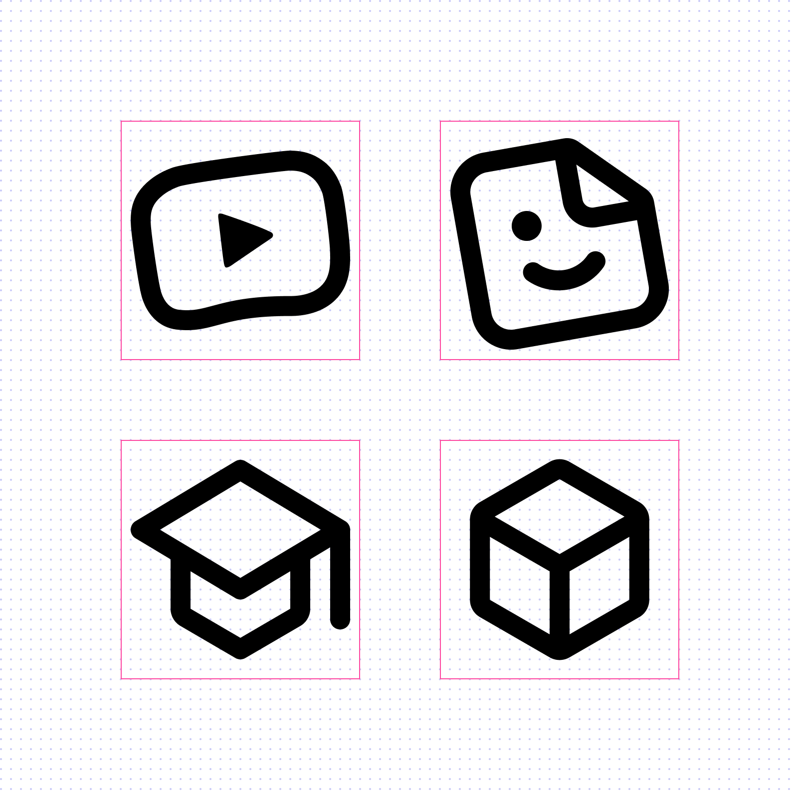
Uniquely YouTube
Beyond function, this update was a chance to strengthen YouTube’s visual identity – the subtle
details that
make our products feel unmistakably like YouTube.
We started with our most recognizable graphic element: the play triangle. I led the team in
integrating
those sharp
angles throughout the icon set, balancing them with soft curves that echo YouTube's logo and
rounded video
thumbnails. Together, these forms captured the spirit of the brand: approachable, expressive,
and
just a little edgy.
A human touch
At its core, YouTube is powered by human creativity. We wanted the icons to reflect that same energy, with each icon feeling intentional and hand-crafted.
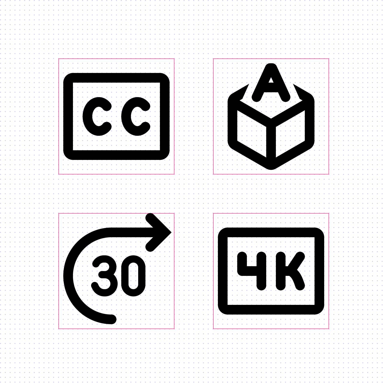
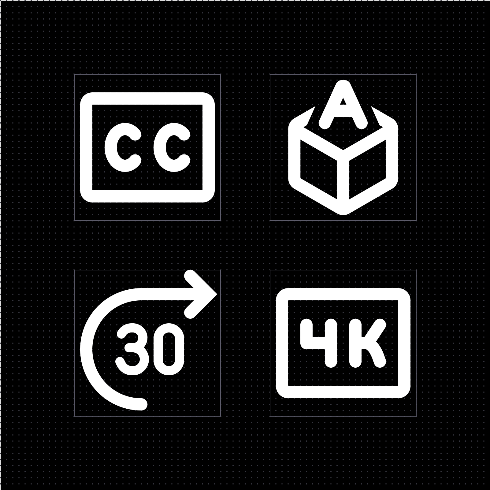
Custom lettering ensures that any text inside icons fits the overall style.
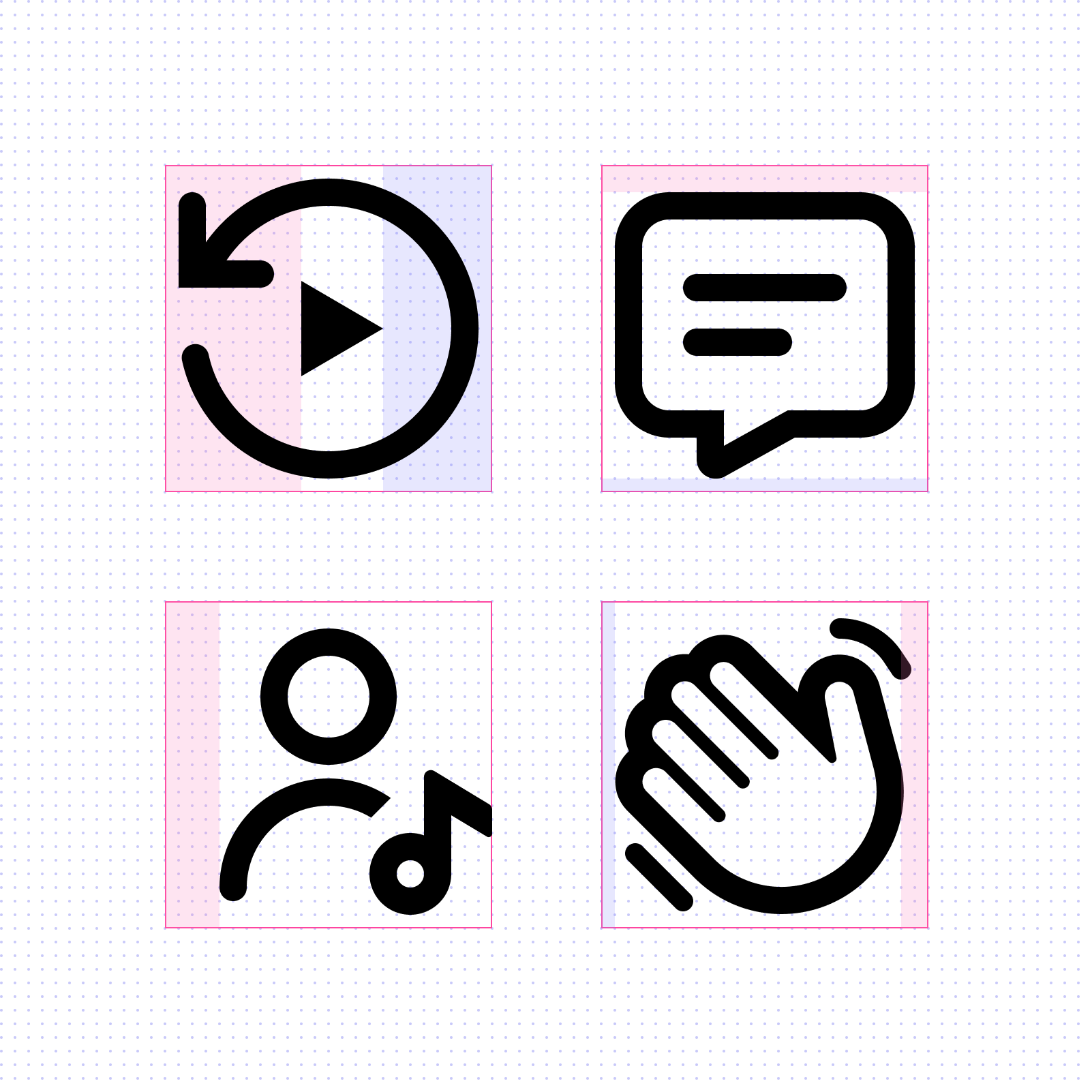
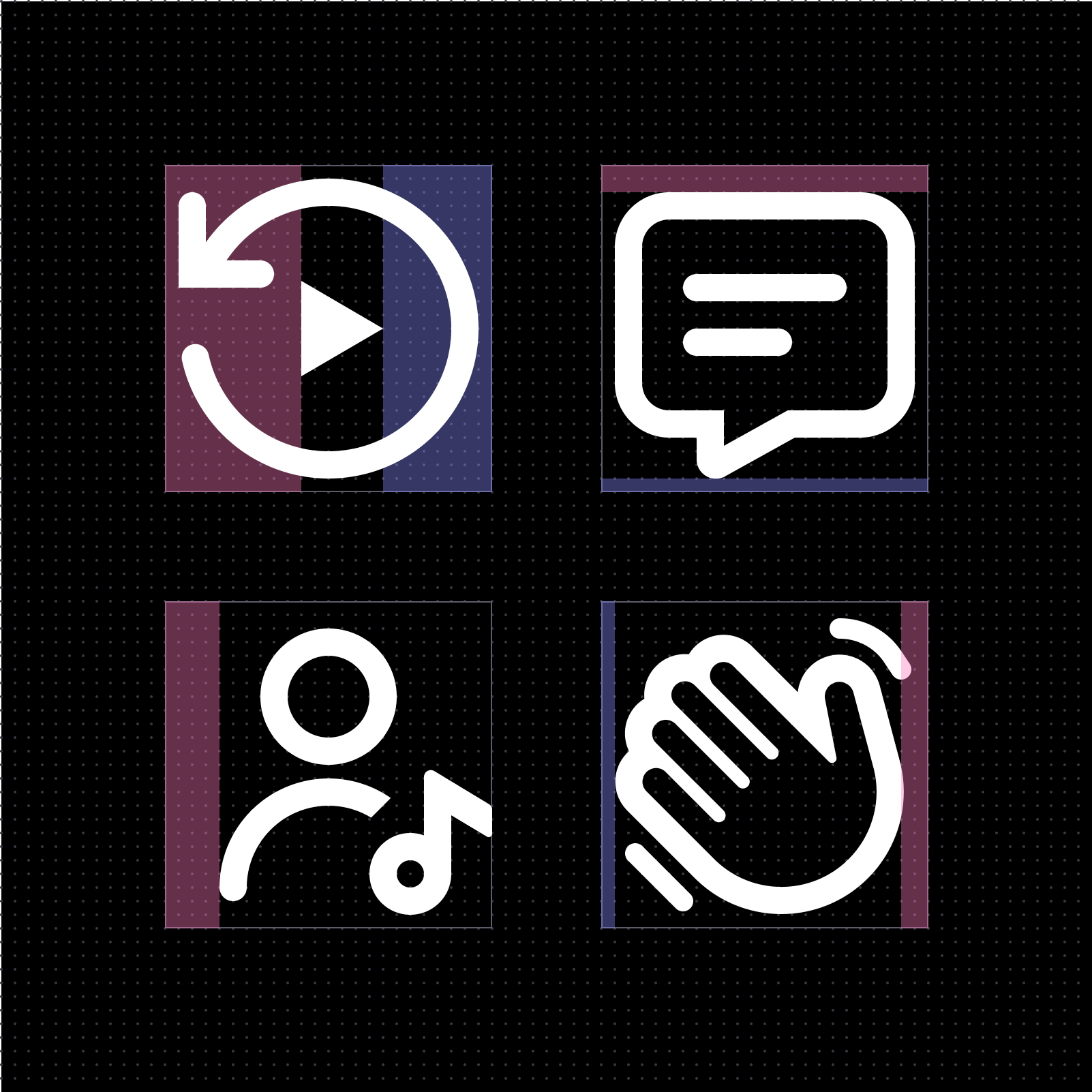
Optical alignment favors what looks right, not what’s mathematically perfect.
Line thickness is adjusted for optical balance, ensuring each icon feels visually even and cohesive within the set
Symmetry improves balance and clarity, conveying stability and approachability.
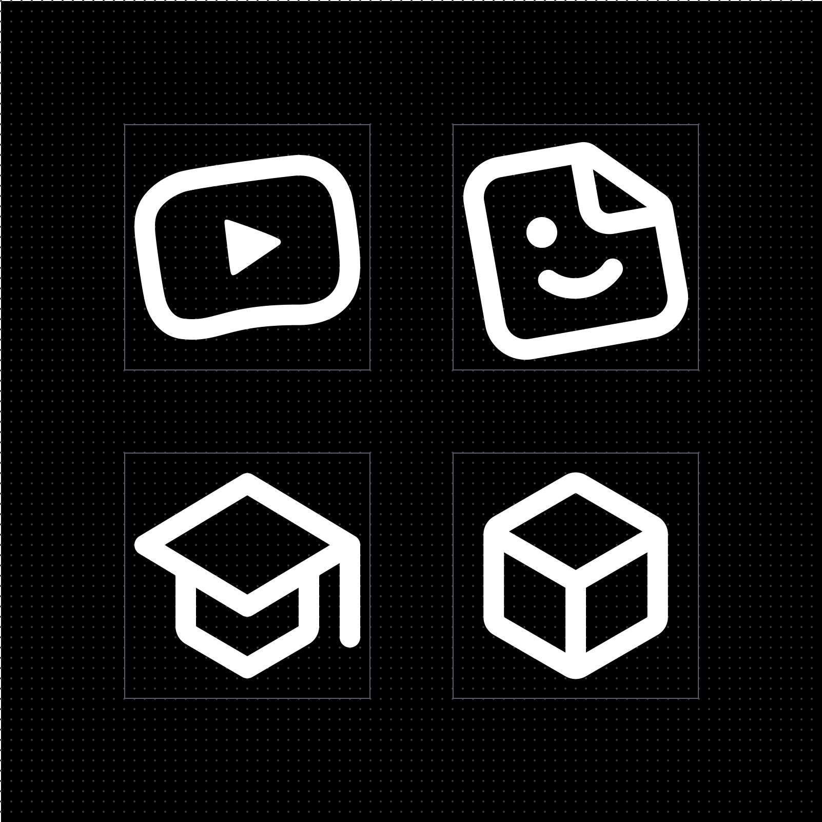
Perspective is used selectively to communicate depth and meaning.
Animations bring moments of delight and reinforce interaction.
Looking forward ⏩
As YouTube enters its third decade, this redesign continues to serve as a part of the design foundation for how the platform connects billions of viewers and creators around the world. My goal throughout this process was to find harmony between utility and creativity, between consistency and expression. This iconography refresh was a meaningful step forward — one that helped set the stage for even more great design still to come.